Jun 25, 2011 - 07:43 AM
By: Willem_Weytjens
After writing an article about the Platinum-to-Gold ratio, I decided to do more with the excel sheet, like calculating correlations and plotting the price charts for example.
In this article, I will just focus on the Gold price.
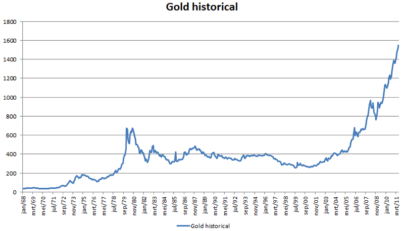
Here we go, the Monthly average Gold Price since January 1968:
It looks a bit bubbly, right?
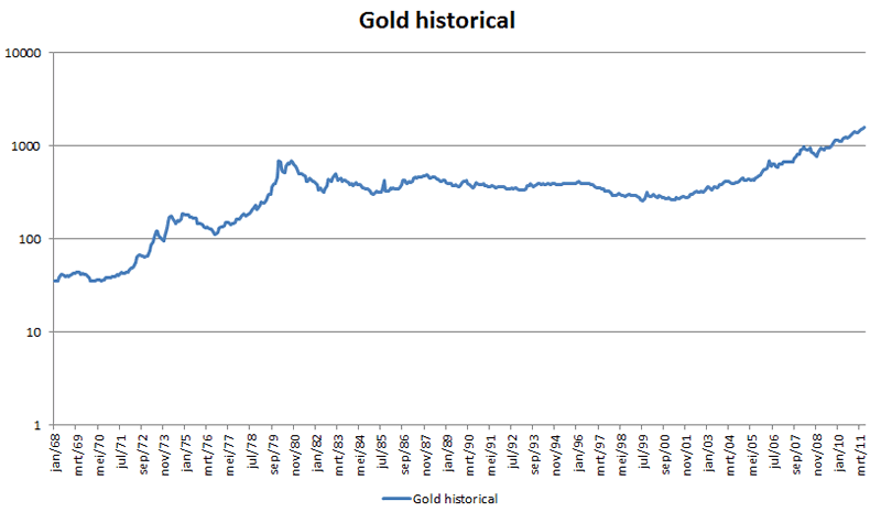
If you think this looks like a bubble, then please have a look at this Log-scaled chart, which looks far from bubbly:
The thing I observed was that the price action in Gold from early 2000 until today was similar to the price action from 1968 until April 1979. Let me show you:
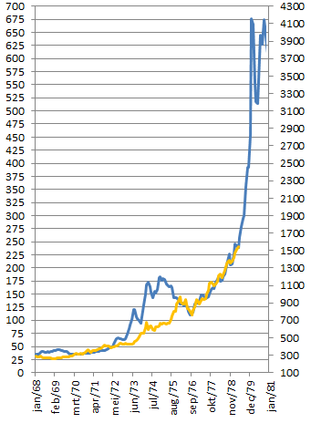
One might argue that the price action from 1972 until 1975 is not similar. I agree. However, the correlation between the gold price from 1968 until 1979 and the gold price from early 2000 until today is an amazing 89,65%.
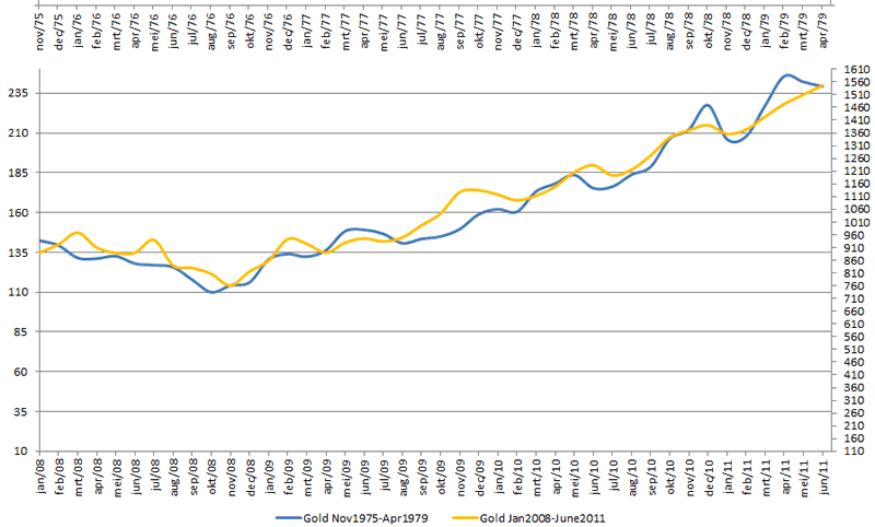
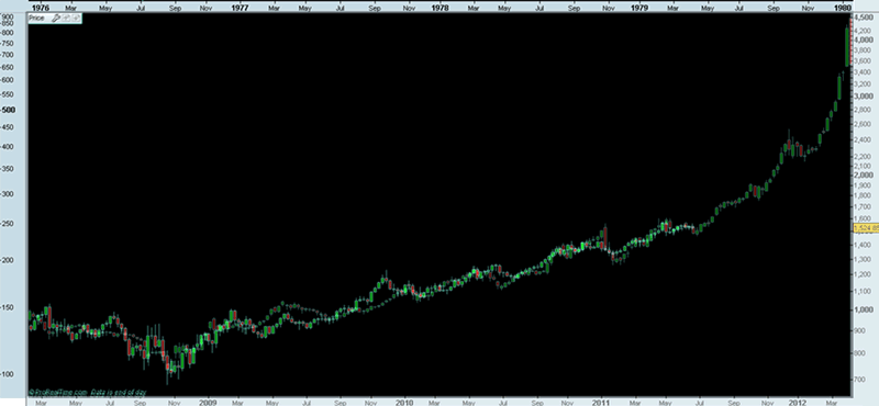
Now what else did I notice? That the price action from November 1975 until April 1979 is almost exactly the same as the price action from January 2008 until today. To show you, here is a chart:
If this monthly chart was not convincing enough, here is a weekly chart (click the chart to ENLARGE):
Chart created with Prorealtime.com
How high do you think the correlation between both periods is (measured on a monthly basis)?
That’s right, an astonishing 97,83%!
Don’t believe me? Here is the excel sheet I used, with data from Kitco.com
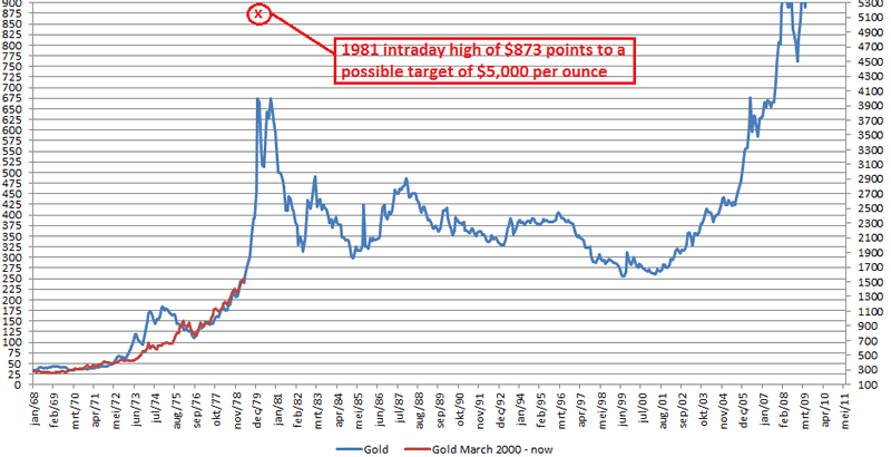
So what would be a price target for gold, based on the 1981 intraday high of $873 per ounce if the correlation would hold?
That’s right, $5,000 per ounce:
Now you have another way to look at mr. Armstrongs prediction of $5,000 gold.
Willem Weytjenswww.profitimes.com

沒有留言:
發佈留言